


Table of Contents
Introduction
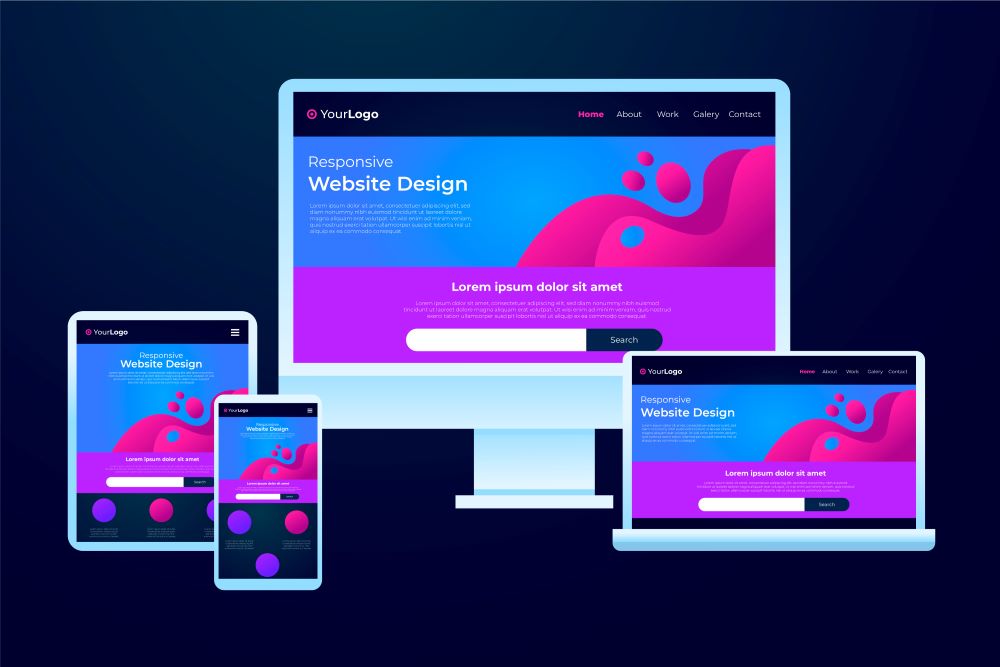
In today’s world, more and more people are using mobile devices to access the internet. This shift towards a mobile-first internet has made responsive web design more important than ever before. Responsive web design is the practice of designing websites that can adapt to different screen sizes and devices, providing users with an optimal browsing experience regardless of the device they use. In this article, we will explore the importance of responsive web design for mobile devices, discussing the benefits it offers to users and website owners alike. We will also outline some key factors to consider when implementing responsive web design and provide some best practices for designing mobile-friendly websites.
Benefits of Responsive Web Design for Mobile Devices
- Improved User Experience
One of the most significant benefits of responsive web design for mobile devices is that it provides users with an improved browsing experience. When a website is not optimized for mobile devices, users may struggle to navigate it, and the text and images may appear too small or too large, making it difficult to read. With responsive design, the website adjusts to fit the screen size of the device, making it easy for users to read and navigate. This means that users are more likely to stay on the website for longer and return in the future.
- Increased Mobile Traffic
Another reason responsive web design is crucial for mobile devices is that it can help increase mobile traffic to a website. As more and more people use mobile devices to access the internet, websites that are not optimized for mobile devices will inevitably lose traffic and potential customers. By implementing responsive design, website owners can ensure that their website is accessible to users regardless of the device they use. This means that website owners can reach a larger audience and generate more traffic to their website.
- Higher Search Engine Rankings
Responsive web design is also essential for mobile devices because it can help improve a website’s search engine rankings. Google and other search engines have stated that they prefer websites that are mobile-friendly, and they will give preference to mobile-friendly websites in their search results. By implementing responsive design, website owners can improve their website’s visibility and increase their chances of ranking higher in search engine results pages. This means that website owners can attract more organic traffic to their website without having to invest in expensive paid advertising.
- Cost-Effective
Responsive web design is also cost-effective for website owners. Rather than having to develop a separate website for mobile devices, website owners can create one website that adapts to different screen sizes and devices. This approach can save time and money, as there is no need to maintain multiple versions of the same website. This means that website owners can allocate their resources more effectively and invest in other areas of their business.
- Future-Proof
Finally, responsive web design is future-proof, meaning that it will continue to be relevant as technology advances and new devices are released. Rather than having to redesign a website every time a new device is released, website owners can rely on responsive design to ensure that their website remains accessible and functional across different devices and screen sizes. This means that website owners can future-proof their website and avoid having to make costly redesigns every few years.
Factors to Consider When Implementing Responsive Web Design
Implementing responsive web design requires careful planning and consideration. Some key factors to consider include:
- Screen Sizes
Screen sizes vary widely between different devices, so it’s essential to design a website that can adapt to different screen sizes. This may involve using fluid layouts, flexible images, and other design elements that can adjust to different screen sizes and resolutions. It is also important to consider the content hierarchy, so the most important information is always visible.
- Navigation
Navigation is critical for mobile devices, as users often have limited screen real estate to work with. When designing a mobile-friendly website, it’s important to consider how users will access the menu and navigate the site. This may involve using dropdown menus, hamburger menus, or other navigation elements that are optimized for mobile devices. It is also important to ensure that the navigation is easy to use and does not require excessive scrolling or pinching to access.
- Loading Times
Loading times are critical for mobile devices, as users expect fast and responsive websites. When designing a mobile-friendly website, it’s essential to optimize images, scripts, and other elements to reduce loading times. This may involve using compressed images, minified scripts, and other optimization techniques to ensure that the website loads quickly and smoothly.
- Content
Content is also critical for mobile devices, as users often have limited attention spans and may be browsing on-the-go. When designing a mobile-friendly website, it’s important to prioritize the most important information and present it in a clear and concise way. This may involve using bullet points, short paragraphs, and other design elements that make it easy for users to consume the content quickly.
Best Practices for Designing Mobile-Friendly Websites
To ensure that a website is optimized for mobile devices, it’s important to follow some best practices for mobile-friendly website design. Some key best practices include:
- Use a Responsive Design Framework
Using a responsive design framework can make it easier to create a mobile-friendly website that adapts to different screen sizes and devices. Frameworks like Bootstrap and Foundation provide pre-built templates and design elements that are optimized for mobile devices, making it easier to create a responsive website.
- Prioritize Content
Prioritizing content is critical for mobile devices, as users often have limited attention spans and may be browsing on-the-go. When designing a mobile-friendly website, it’s important to prioritize the most important information and present it in a clear and concise way.
- Use a Mobile-Friendly Navigation
Using a mobile-friendly navigation is essential for mobile devices, as users often have limited screen real estate to work with. When designing a mobile-friendly website, it’s important to use a navigation that is optimized for mobile devices, such as a dropdown menu or hamburger menu.
- Optimize Images and Scripts
Optimizing images and scripts is critical for mobile devices, as users expect fast and responsive websites. When designing a mobile-friendly website, it’s important to optimize images and scripts to reduce loading times. This may involve using compressed images, minified scripts, and other optimization techniques.
- Test on Multiple Devices
Testing a website on multiple devices is essential to ensure that it is optimized for mobile devices. When designing a mobile-friendly website, it’s important to test it on a range of devices, including smartphones, tablets, and laptops, to ensure that it adapts to different screen sizes and devices.
Conclusion
In today’s mobile-first world, responsive web design has become an essential component of website development. By designing websites that can adapt to different screen sizes and devices, website owners can provide users with an optimal browsing experience and improve their website’s visibility and search engine rankings. When implementing responsive web design, it’s essential to consider factors such as screen sizes, navigation, loading times, and content. By taking these factors into account and following best practices for mobile-friendly website design, website owners can create websites that are accessible, user-friendly, and future-proof. As mobile devices continue to become more prevalent, responsive web design will only become more important. By embracing responsive design, website owners can stay ahead of the curve and provide their users with a seamless browsing experience across different devices and screen sizes.